Copy/Paste from Xrite i1Profiler documentation
In i1Profiler, a slider and numeric combo is used while in Caldera we use a numerical value (same principle and same values).
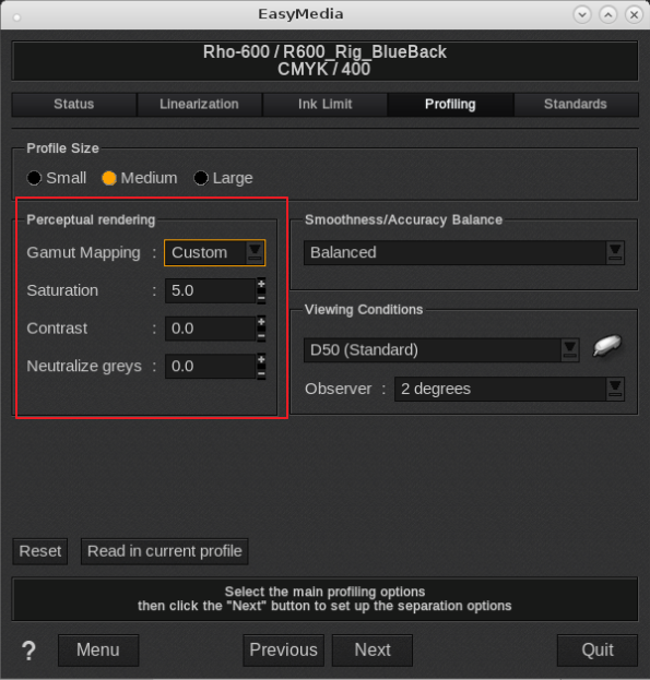
EasyMedia:
i1 Profiler (X-Rite)
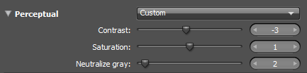
Perceptual Rendering
Color rendering is the strategy used to convert the colors in an image into colors that your printer can print. Different rendering intents have different priorities.
In cases where the colors in your image far outnumber the colors you can print, it is common to use the perceptual rendering intent to transform the image colors into your printer’s color space.
The perceptual intent is intended to preserve the look and feel of the original image, maintaining tone and detail as a first priority, and saturation/color accuracy as a second priority. Perceptual rendering can also be tuned to achieve customized results, allowing the profile to trade detail and tonality for greater saturation and contrast.
The controls provided in i1Profiler/EasyMedia allow you to customize contrast, saturation, and neutral color rendering when using your profile to convert colors with perceptual rendering.
Use the perceptual preset options or create your own custom settings.
Custom settings explained
(Remember Caldera uses a +/- value and not a slider, same values can be entered):
Contrast
The contrast slider increases the apparent contrast of your output.
Use this slider to lower the contrast (negative value in EasyMedia) if you feel that dark areas in your image are losing detail. You may also increase the value of this slider if you believe that your printer is capable of producing a stronger black (positive value in EasyMedia).
Saturation
The saturation slider increases the apparent saturation of your output.
Use this slider to increase color strength in saturated colors. You may also decrease this slider if you wish to reveal greater detail in saturated color areas.
Neutralize gray
When rendering gray values using the perceptual intent, those values are shifted slightly to align with the color of the paper. If the paper is yellow, then the grays are rendered with a yellow cast to appear neutral compared to the paper.
The neutralize gray slider allows you to adjust gray mapping to be more in line with the paper (high value), or to be more measurably neutral (low value). It is recommended to keep the default setting unless you are using paper with a heavy color tint.