Gamut definition
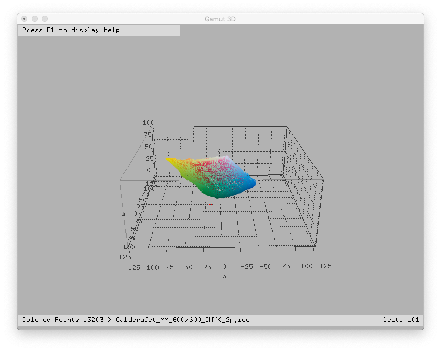
A color gamut is the set of independent colors a given device can reproduce. It is often expressed with the CIE Lab color space and looks like this:
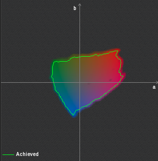
 It can also look like a "2-D slice" of colors:
2 different devices can reproduce 2 different gamuts that generally do not have the same boundaries. So, this means that you can not reproduce exactly all the colors coming from one device to another and there are big chances that gradients can be flattened or broken in some regions of the gamuts. Example:
Every color device has a color gamut. And even grayscale printers have, although they are much simpler to represent because basically they can represent only one axis and can be plotted on the vertical axis (luminosity).
That's why the rendering intent concept has been invented by ICC.
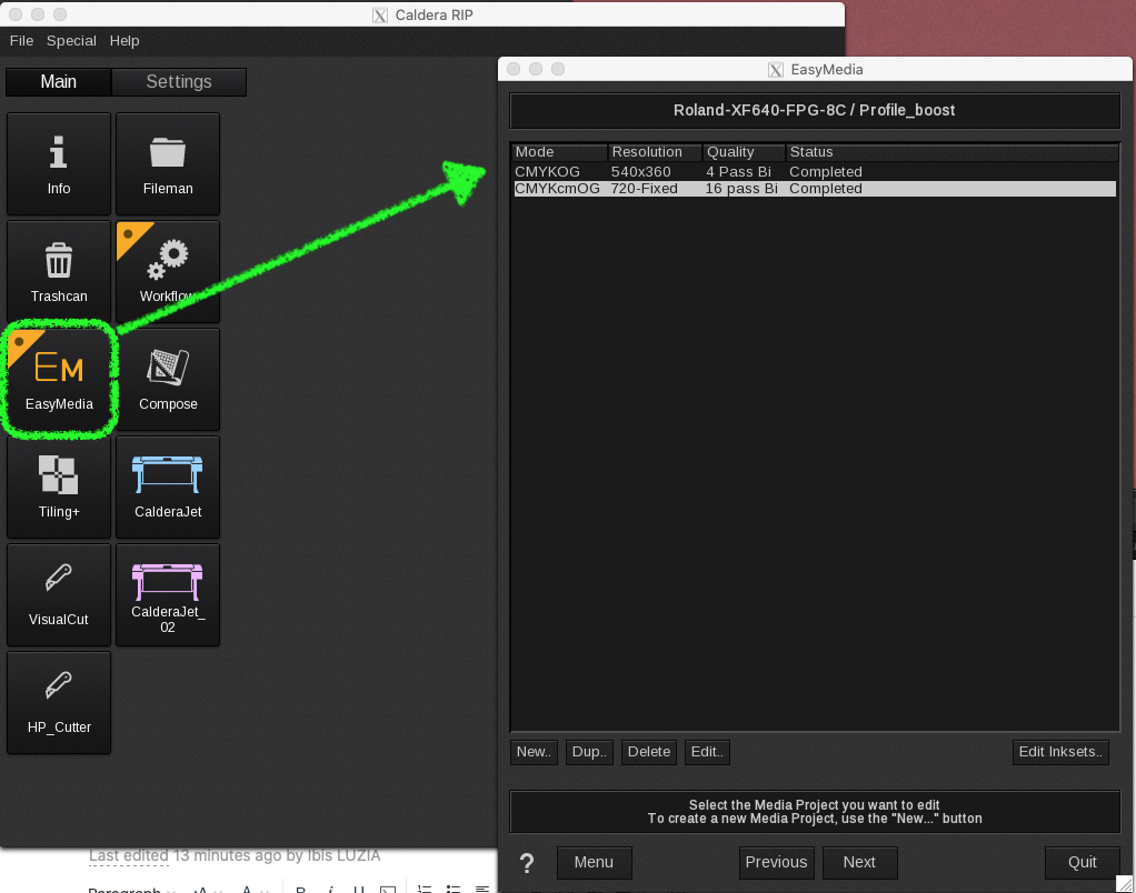
Using the EasyMedia module to compare and view the printer gamut
With Caldera EasyMedia is easy to see and do the analytical comparisons with different printer gamuts.
It is possible to compare a printer mode with another within the same printer and printing condition, with another printing condition, new and old color profiles, one printer against the other, one printing mode against the Pantone scale, etc.
1. Select a printer and print mode in EasyMedia.
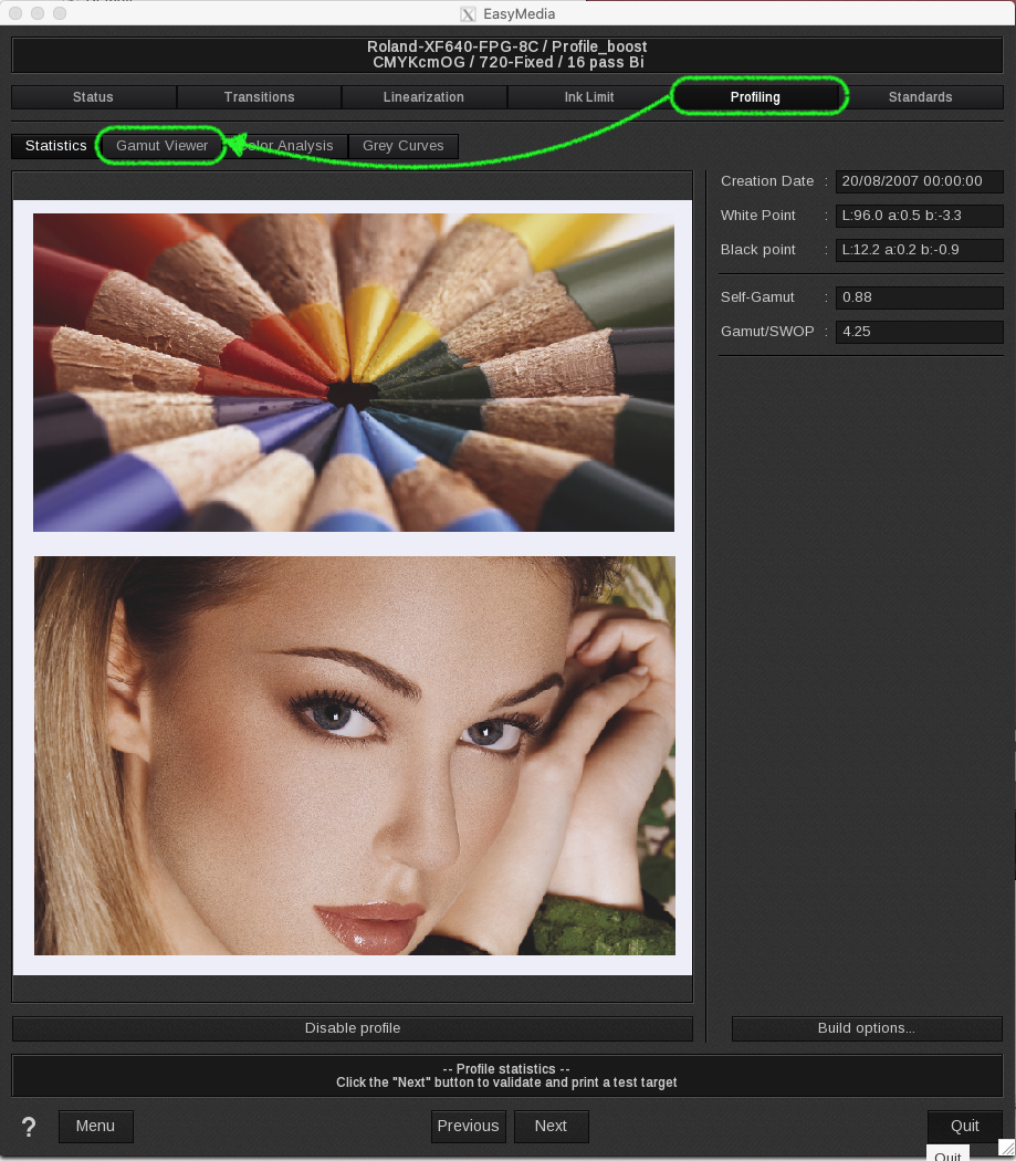
2. Then go to the Profiling tab and Gamut viewer within the same tab.
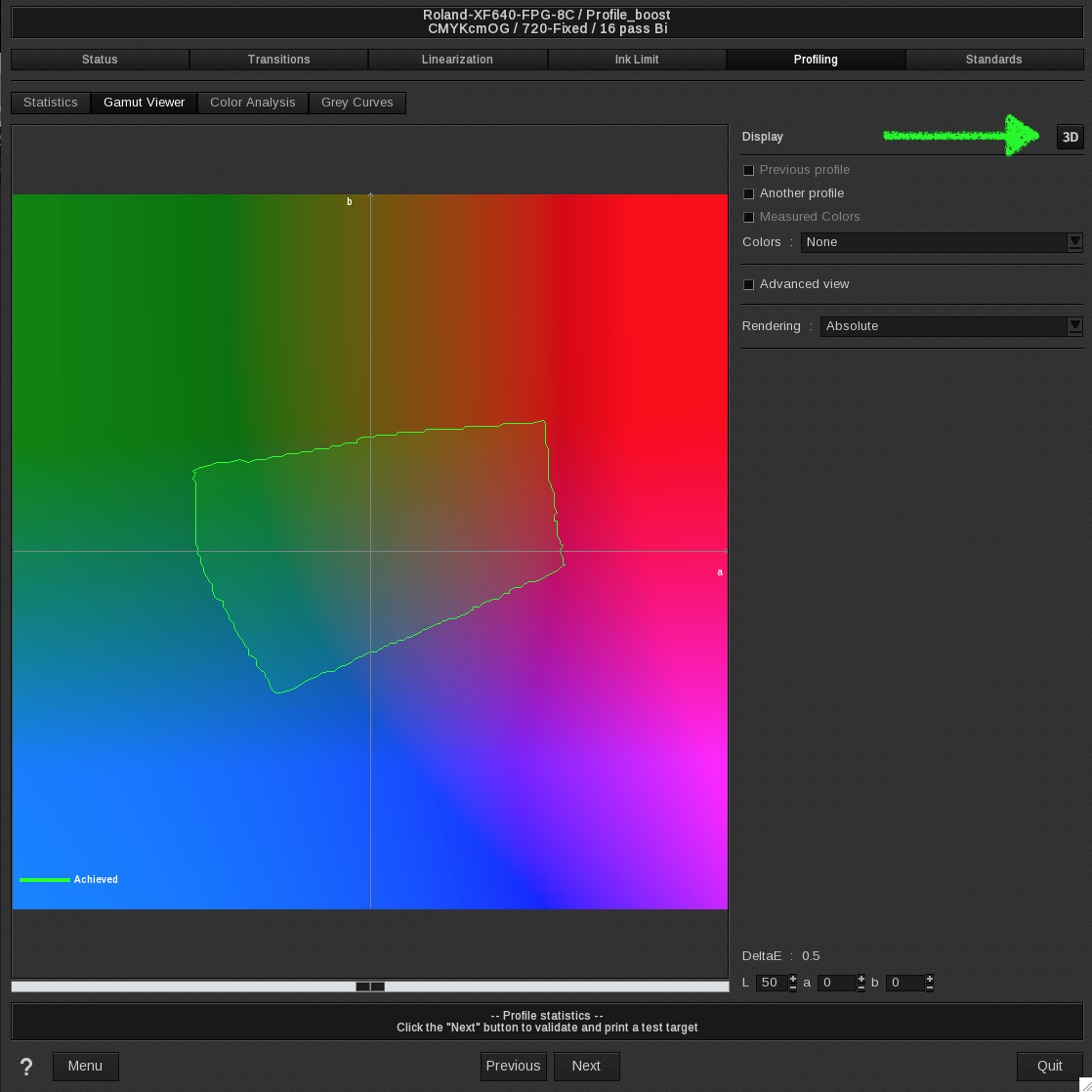
3. You will get to the 2-D gamut view of the actual printing mode. To view it in 3-D, click the 3D button on the right corner of the screen.
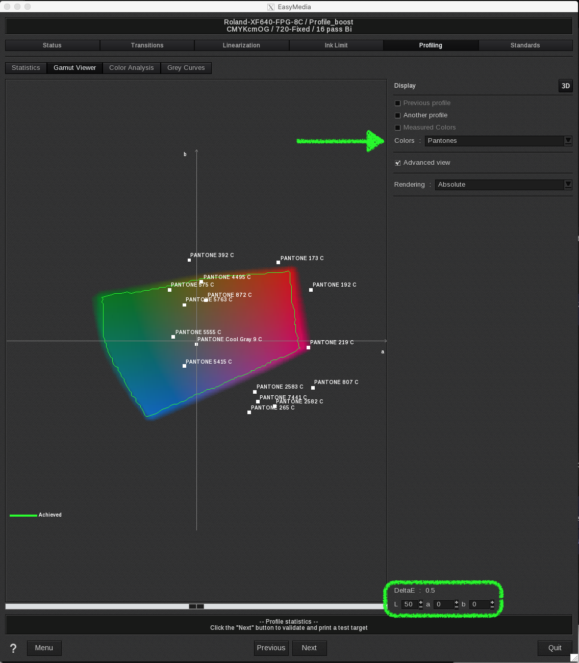
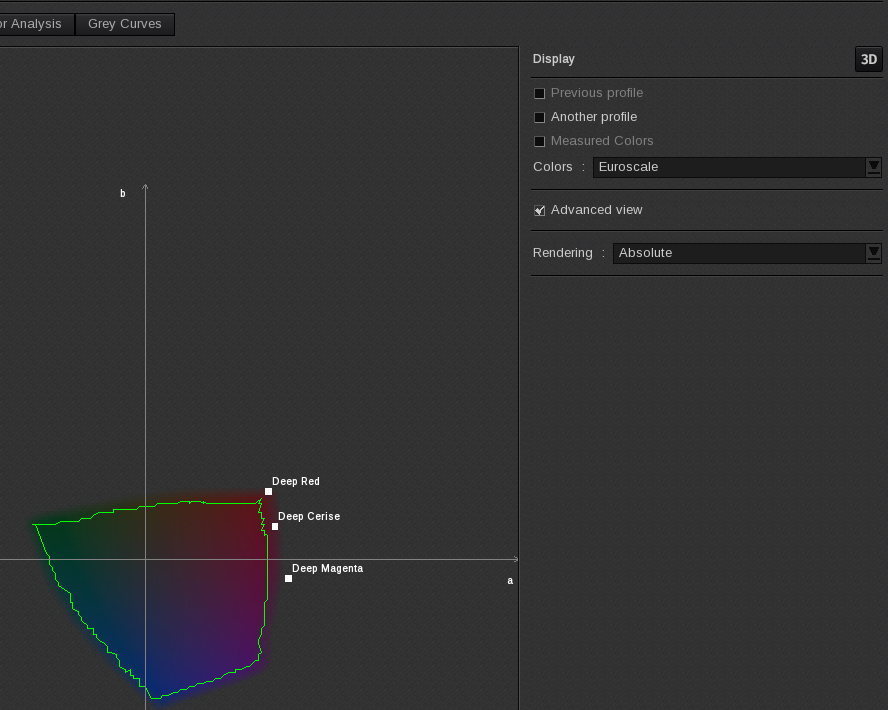
Comparing the actual gamut with the Pantone scale
Selecting the option "Pantones" on the Colors field displays the Pantone swatches near the referred luminosity point adjusted on the bottom scroll bar.
You can slide the scroll bar to the left or to the right in order to adjust the luminosity region of the present gamut. This will give you a direct graphical visual reference of the colors reproducible with the actual print mode.
The Delta E value on the right shows the expected color deviation for the XY coordinate where the mouse pointer is. For the out-of-gamut colors, placing the mouse over a specific Pantone reference gives you the expected Delta E error for that particular swatch.
This tool is useful when a customer wants some Pantone shade printed but you are not sure if the printer with the actual profile/print is able to reproduce it or not.
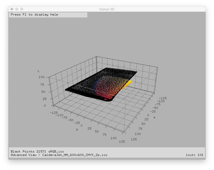
The Advanced view option highlights the actual gamut by shadowing the surrounding background.
Comparing the actual gamut with some shades of standard scales (Swop, Fogra, Euroscale, etc.)
In the same way, as we did with the Pantone scale before, it is possible to select some particular shades from standard scales commonly used across the Graphic Arts community around the world (like Euroscale in Europe, Swop for the US, etc.).
Select the standard you want in the Colors field.
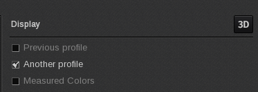
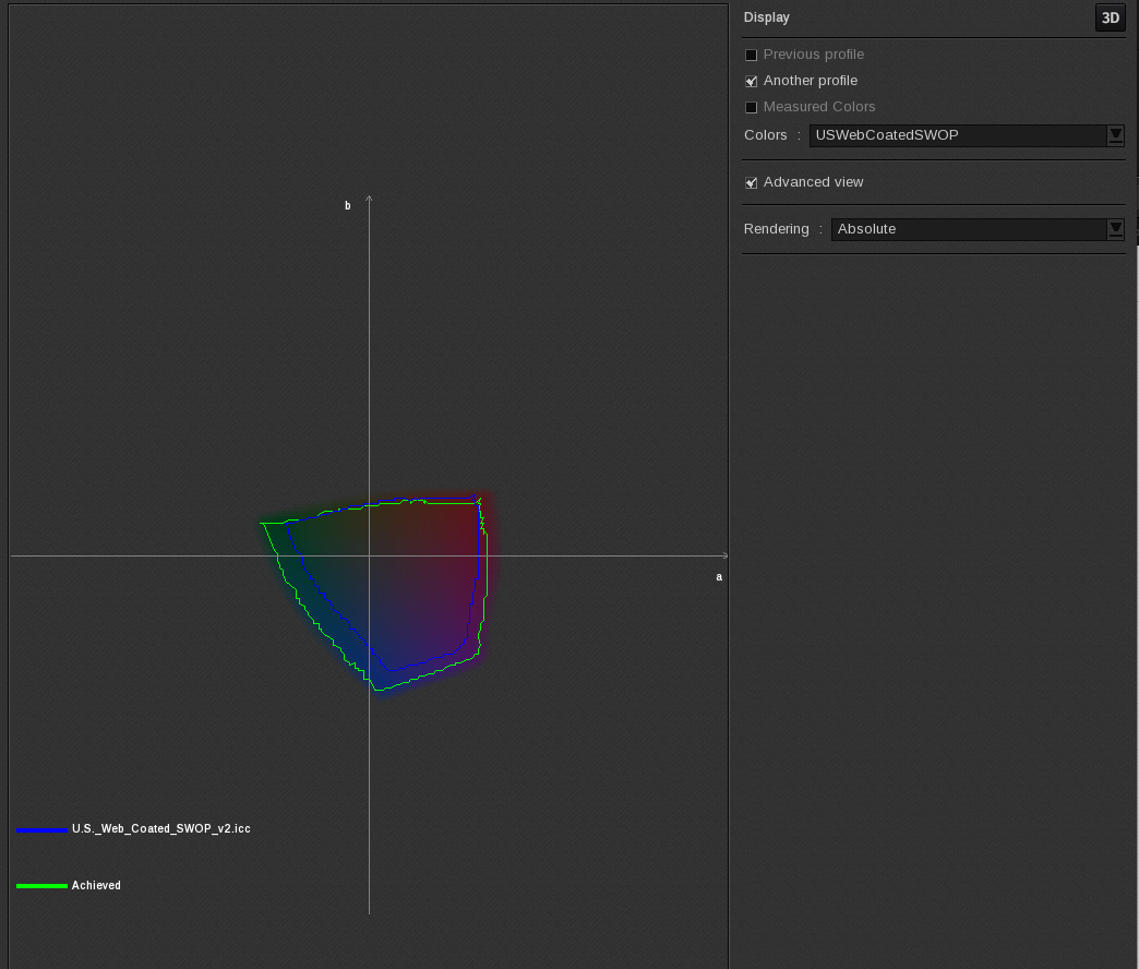
Comparing the actual profile with another profile
Clicking on the Another profile option, gets you to the Explorer Window where you can select some other standard color profiles to compare with the actual printer condition (eg.: Isocoated, sRGB, AdobeRGB1998, etc.)
It is possible to select another Caldera printer (on the top section "All printers") and compare the actual print mode with another printer, or even compare it with another print mode within the same printer.
The blue line indicates the standard gamut and green line the actual gamut.
Comparing the actual profile with the previous one
Under the Display option, check Previous profile for visual comparisons between the present profile and the previous one if you are re-profiling the actual print mode. This will give you a clue about the most affected areas with the changes made on the present profile.